Re-branding
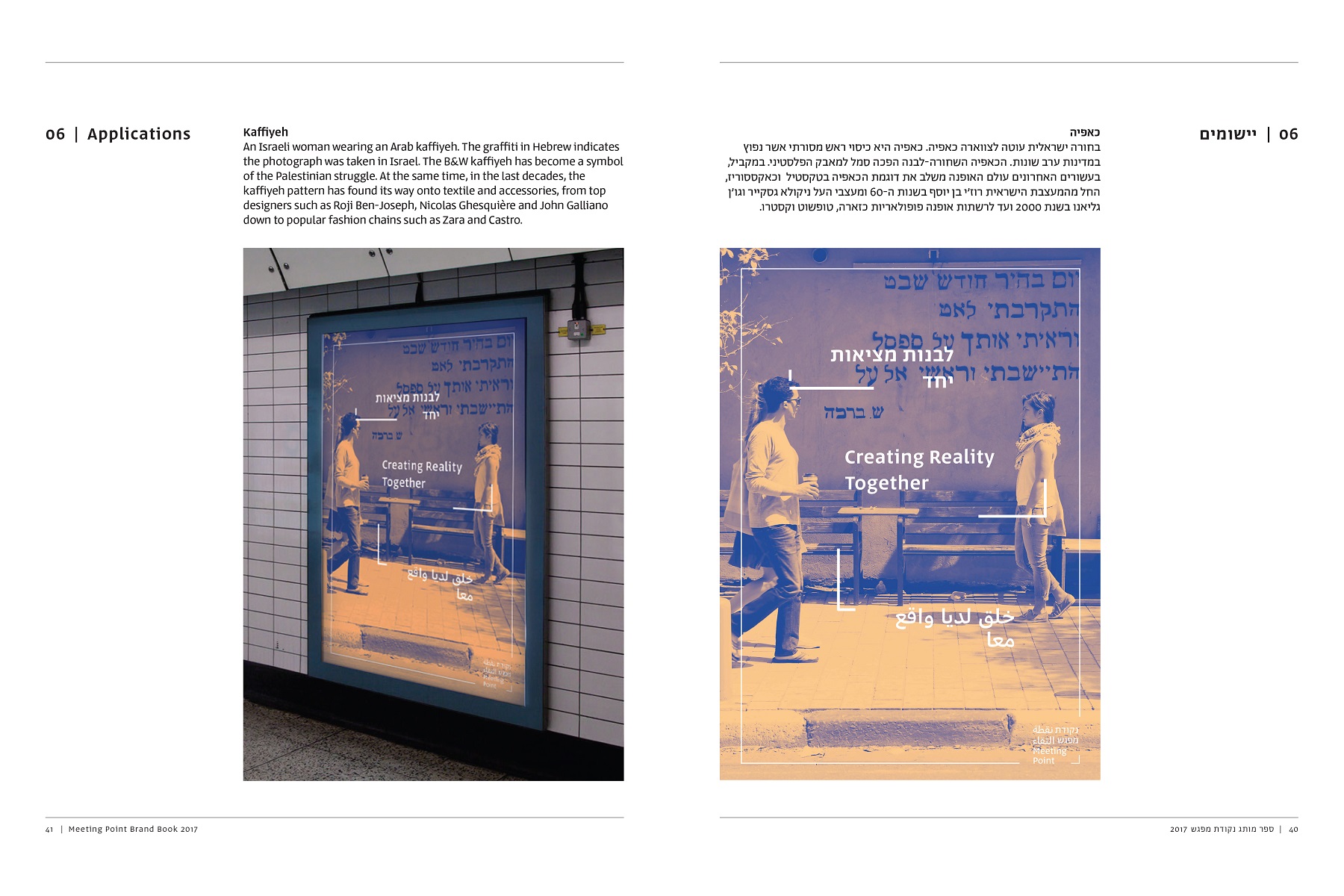
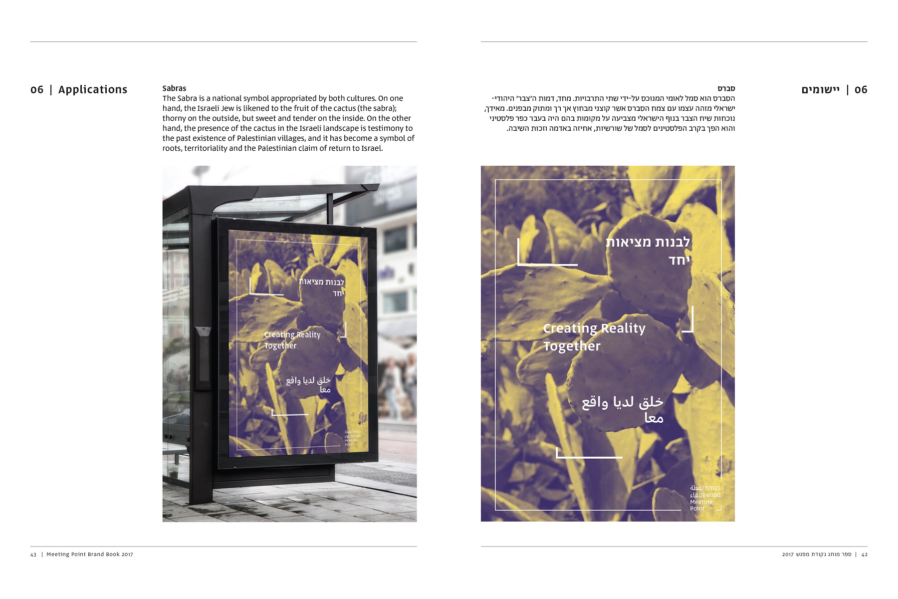
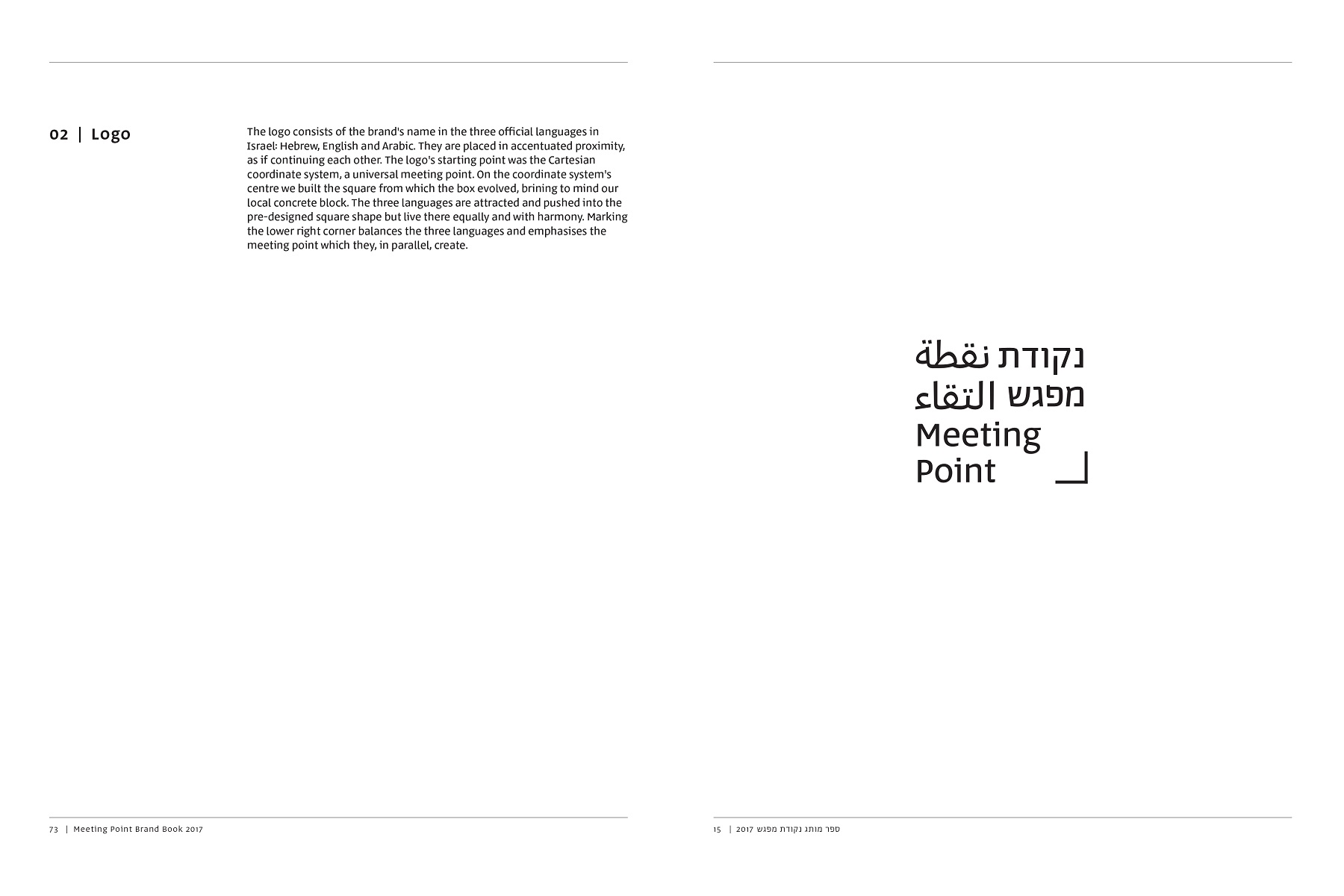
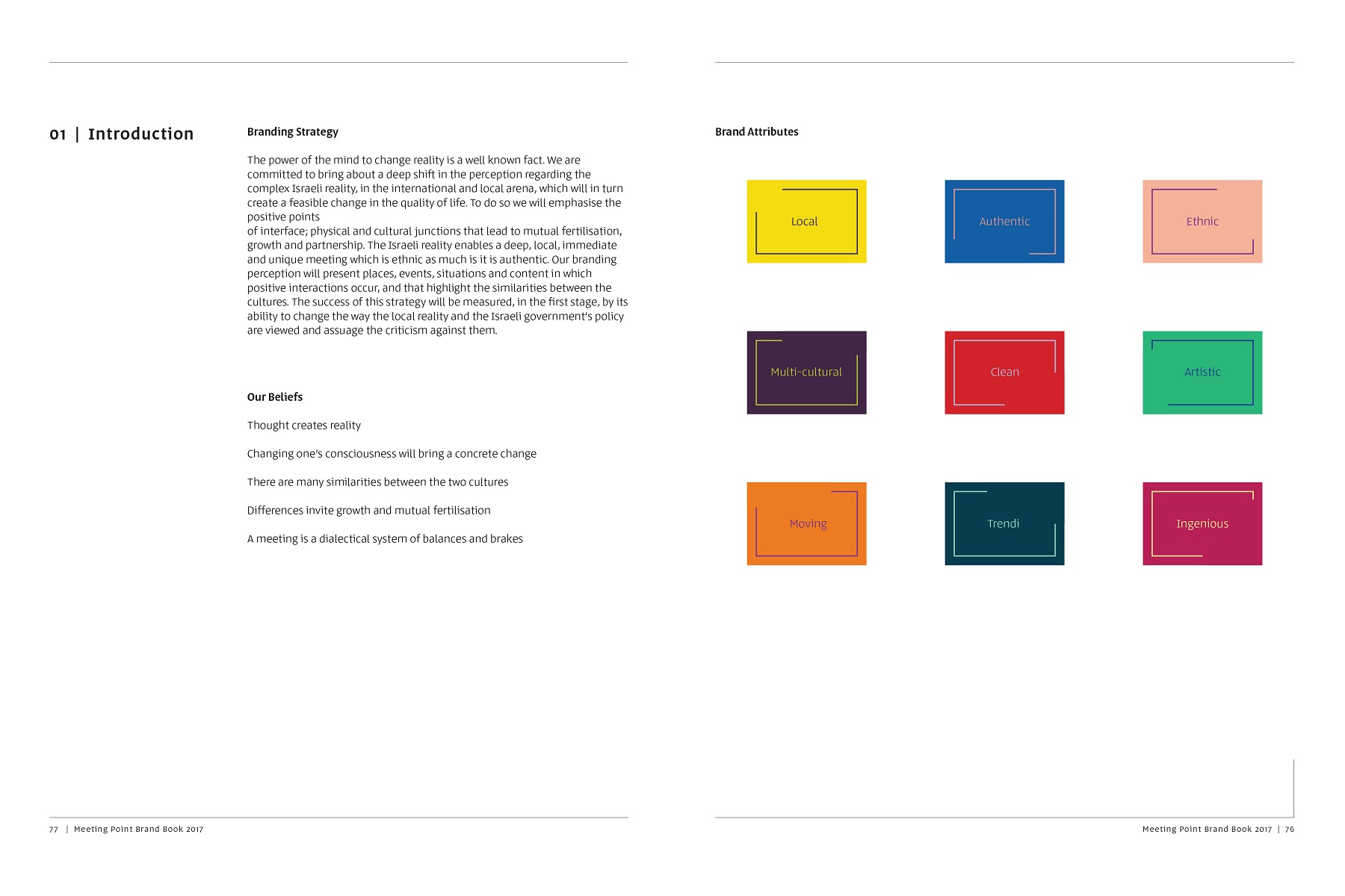
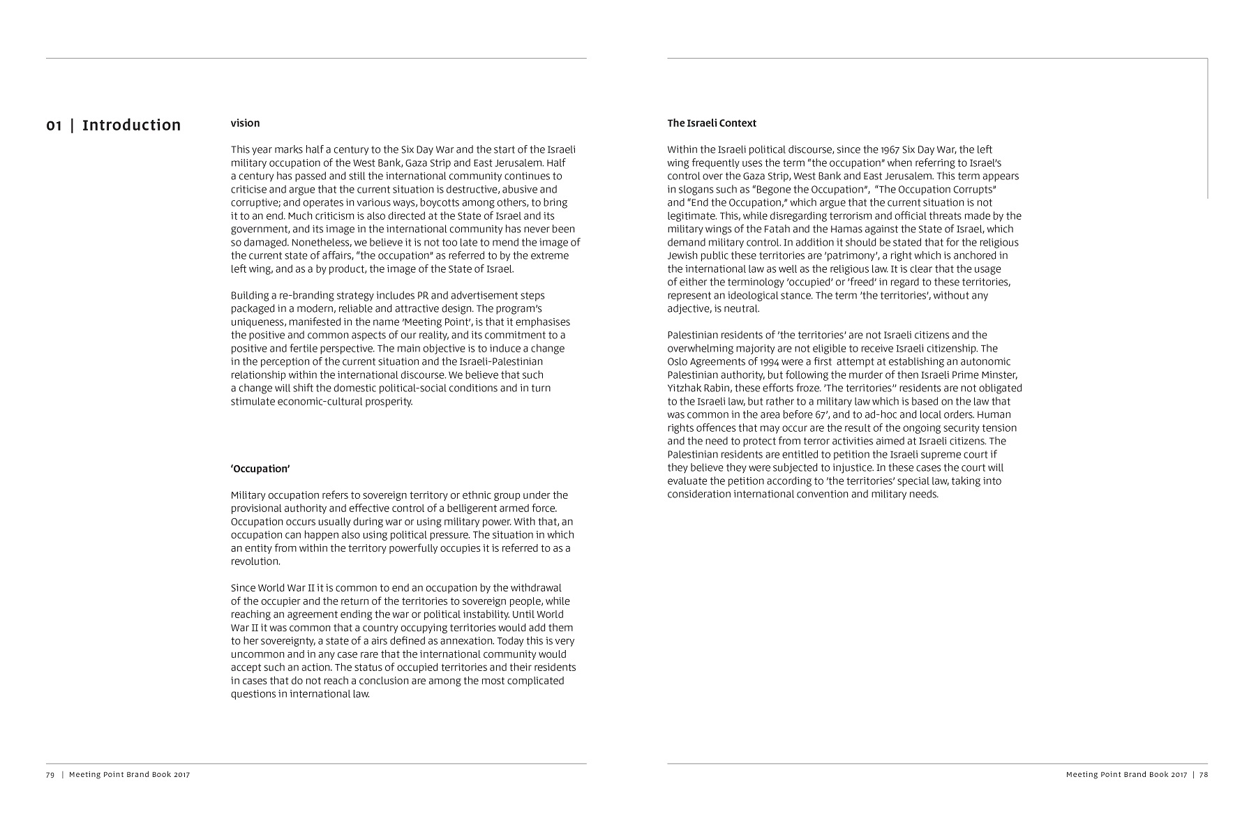
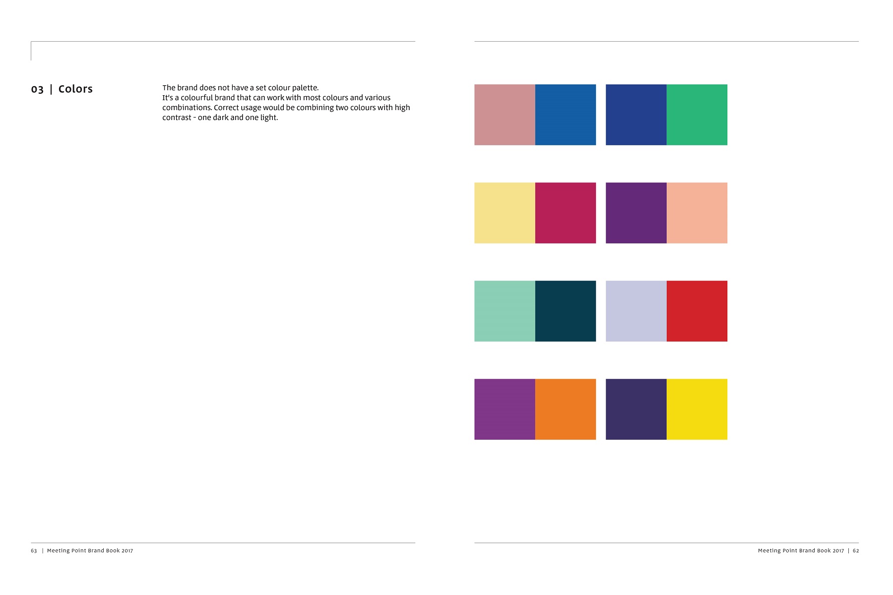
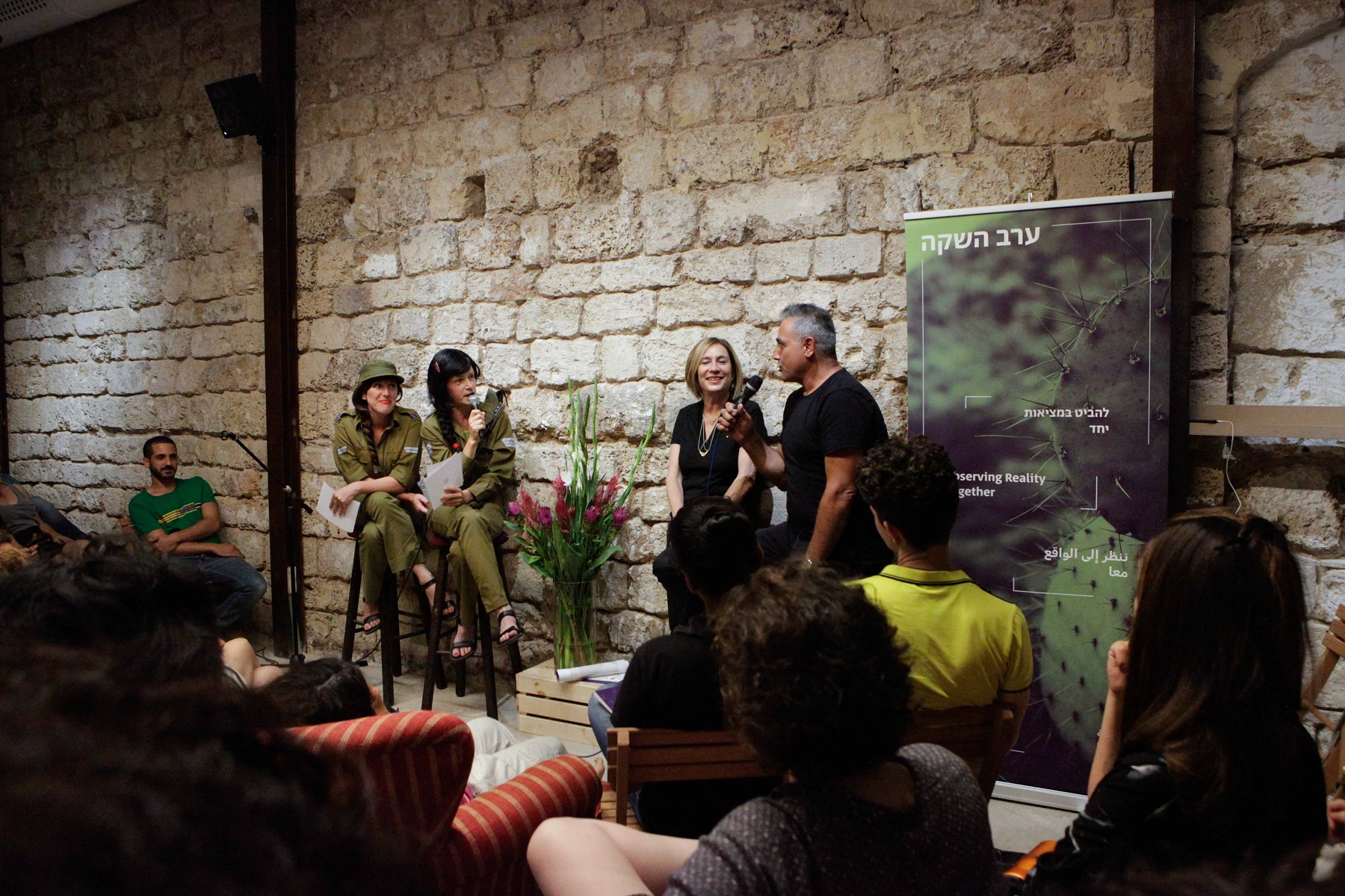
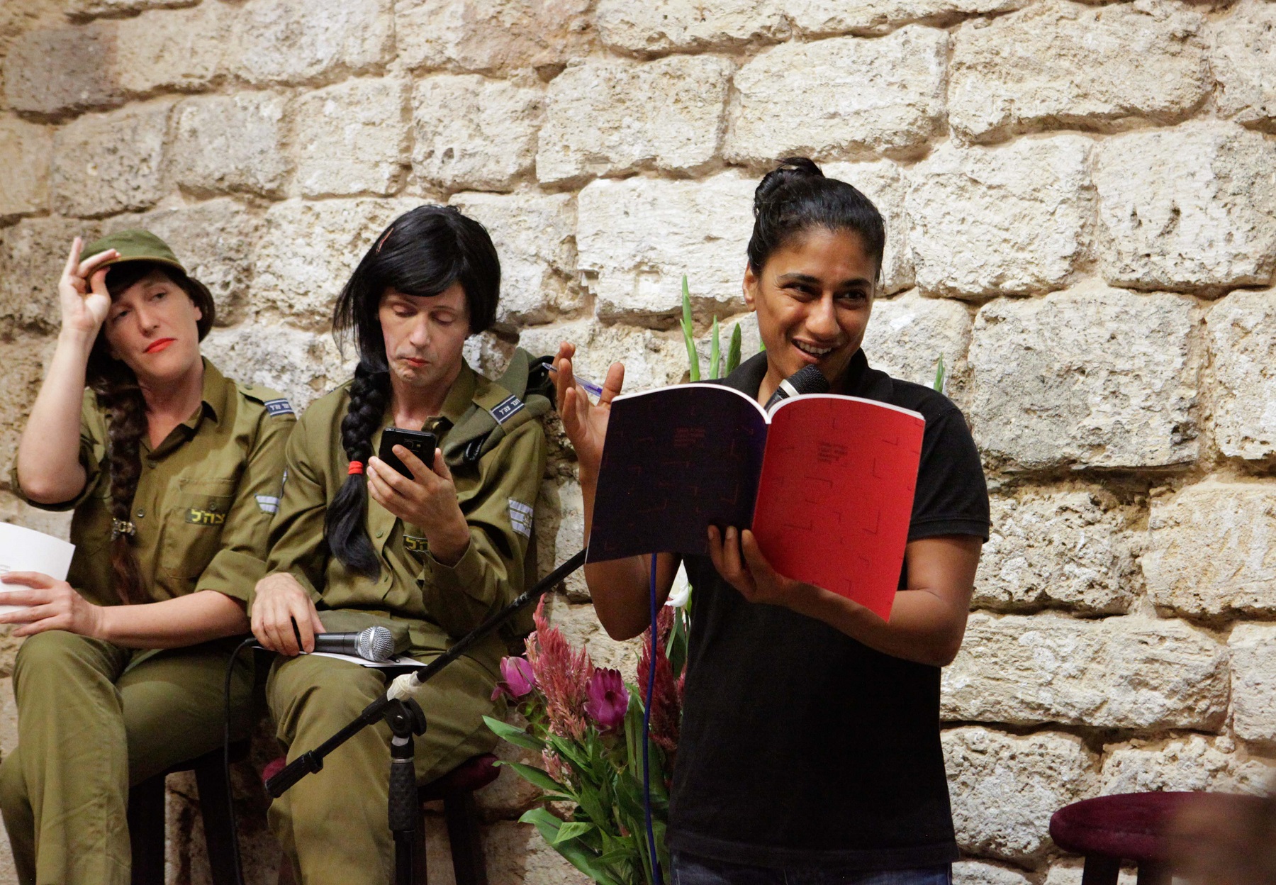
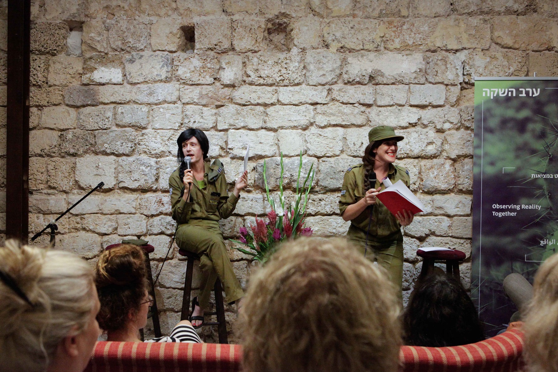
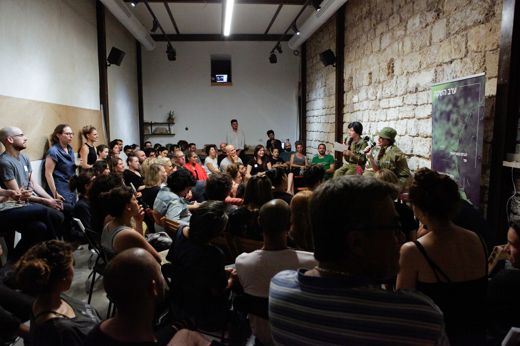
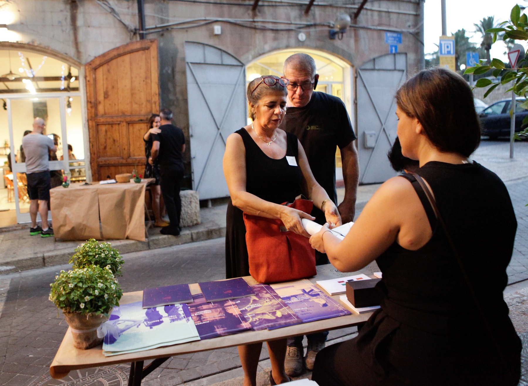
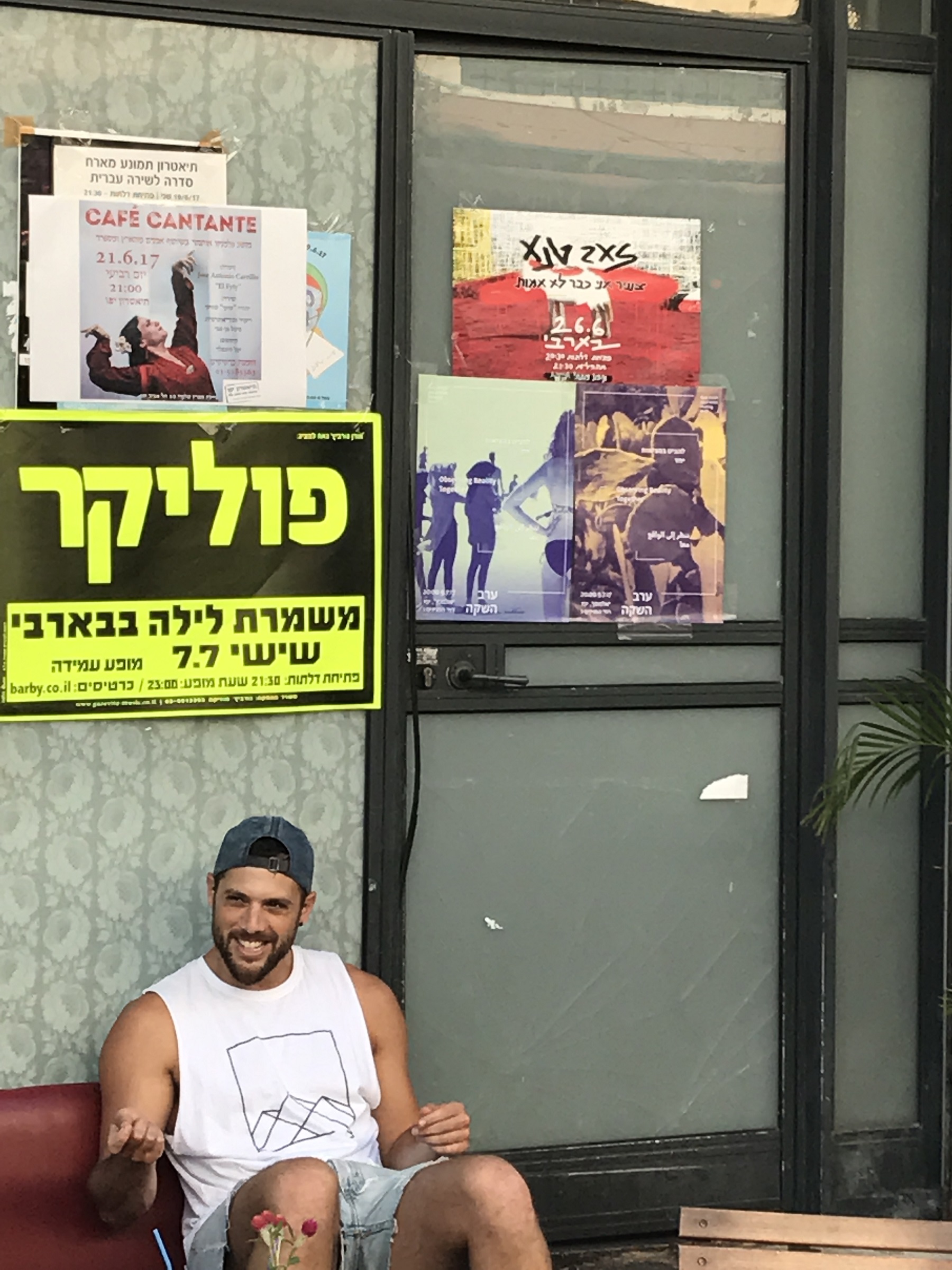
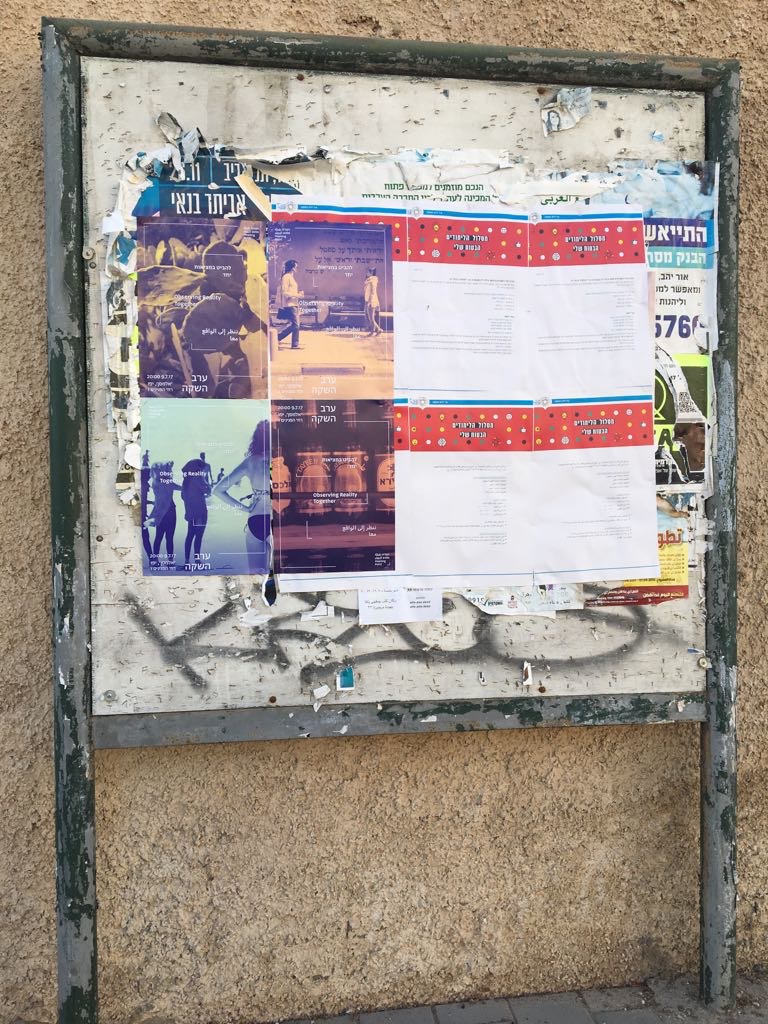
This project utilizes the strategy of subversive affirmation, in other words, it mimics to an absurd extreme the exact mechanisms or structures it is critiquing. The project presents a mock re-branding strategy for the Israeli Occupation that tries to present it as a positive situation which leads to the bridging of cultures. The work uses fashionable visual design language and treats the occupation as any other business suffering from bad branding. It ridicules and reveals the absurdity in the current war of images on the public appearances of governments and corporations, whose main victims are their respective civilians and consumers. In collaboration with a graphic designer I produced a full brand book for the fictive and fraught re-branding initiative that provides the brand’s vision, beliefs, and aesthetic strategy. The book is 86 pages long in both English and Hebrew, excluding the Arabic language. This highlights the hurtful reality in which the Israeli government’s efforts are intended towards Jewish Israelis and the international (specifically US) community, disregarding the other side of this conflict and the inhabitants of this region.

